Object comparison
The business has requested that the comparison table be optimized for consistent usability and readability across all devices, including desktops, tablets, and smartphones.
Problem
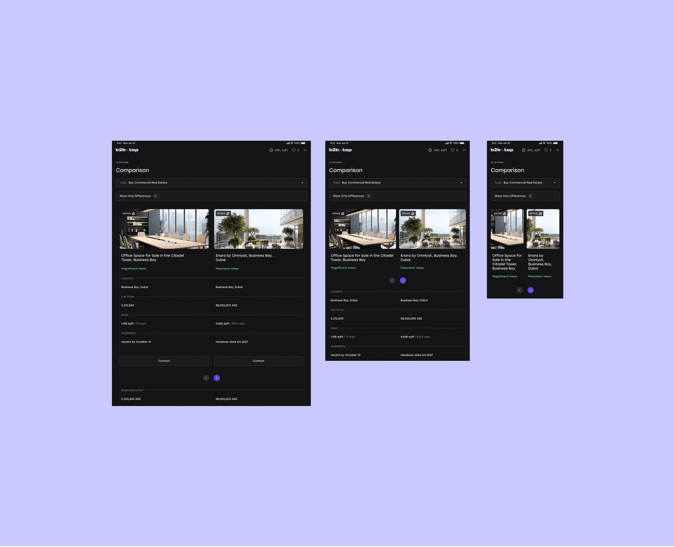
Table Doesn’t Display Well on All Devices
Solution
Use horizontal swipe with a hint
Result
Table becomes accessible and user-friendly on all devices, , improving user interaction
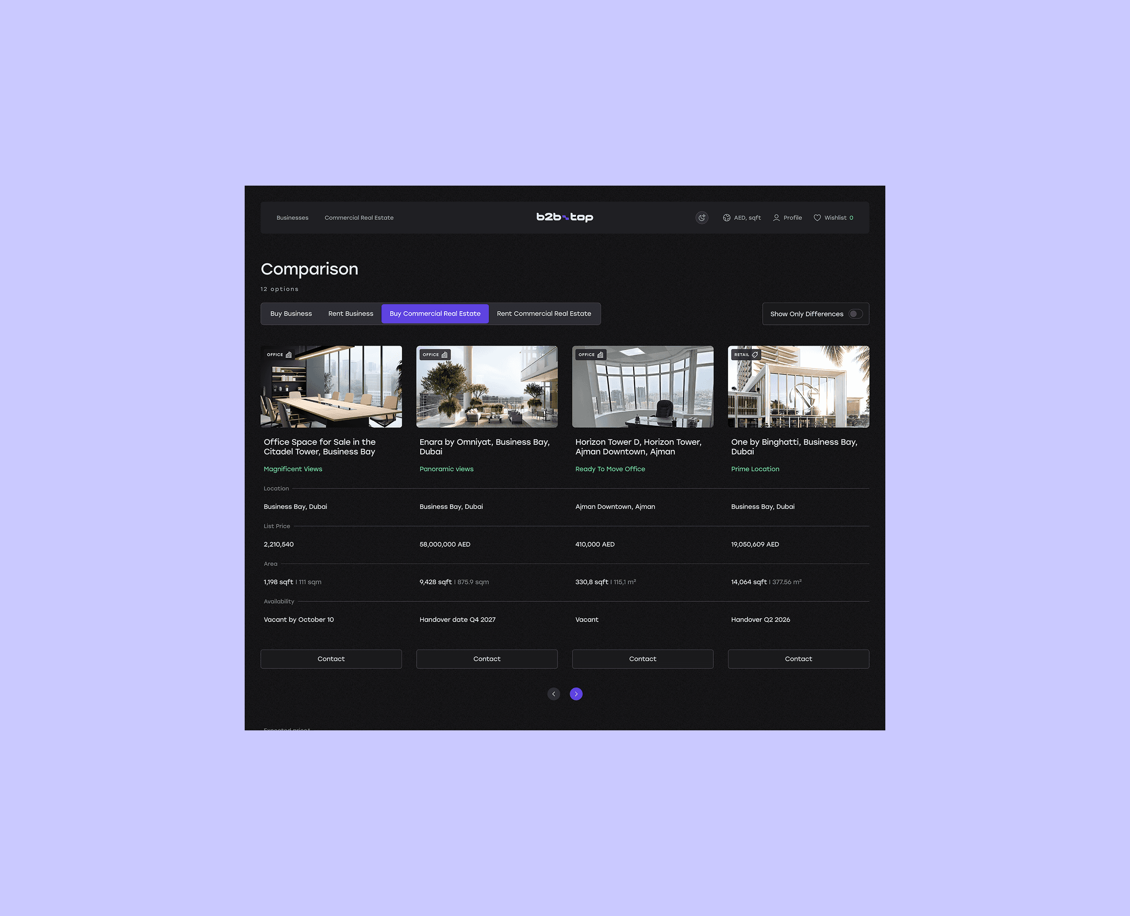
The comparison feature is available on some real estate platforms, but it is far from being a standard. Even where it is implemented, table responsiveness on mobile devices is often inconvenient: the number of properties that can be compared is limited, readability is compromised, or the feature is entirely missing in mobile versions. This significantly impacts the user experience, especially considering that many users browse listings on their smartphones. After analyzing competitors that have implemented responsive comparison tables, we selected a solution that offers optimal readability, ease of interaction, and a clear interface across all devices. As part of the solution, a horizontally scrollable table was implemented with fixed headers that remain visible to preserve context. When the number of compared items exceeds the screen width, an active forward navigation arrow appears on the right, indicating the presence of additional content. All of this made the interface more intuitive and user-friendly, especially on mobile devices.

After successful testing of the animated prototypes with the involvement of the client representatives, all feedback and suggestions were carefully considered. Based on the received input, the solution was finalized, approved, and handed over to development for further implementation.